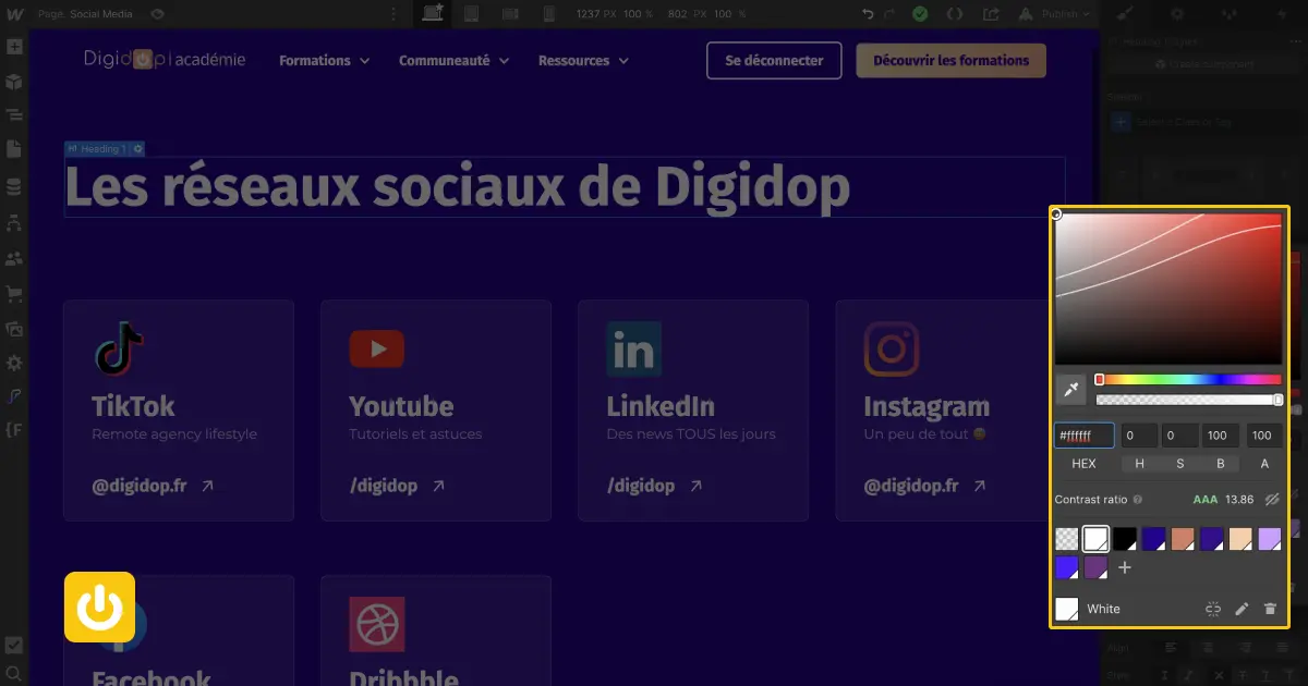
Thanks to this tool integrated to your designer interface, you can easily improve the web accessibility of your texts on your webflow website! 👉
At Digidop we are convinced that web accessibility is the major issue of the next 10 years.
To have an inclusive website, there are dozens of points to consider. Among them, we will talk today about :
👉 the readability of text on a webflow site.
The Contrast Ratio on Webflow
The color contrast between your text and its background plays an essential role in the readability of your message. And with the naked eye, it's not always easy to make sure your content is accessible.
Fortunately, you can use Webflow's"Contrast Ratio Checker" tool to easily analyze your content for accessibility.
A visual tool to check text/color accessibility
On Webflow, you have natively a tool that allows you to check that your text is readable for the user of your web page.
Based on the WCAG recommendations (accessibility standard) the tool evaluates the readability of your text with 3 ratings:
- AAA ✅✅
- AA ✅
- Fail ❌
Note: In order to offer the best possible experience on your site, we recommend that you systematically go for a triple A rating.
How to use it on webflow?
But... Where to find the Contrast Ratio Checker?

You can find the tool directly in your webflow project (designer interface). For that :
- Select the text you want to analyze
- Go to the Color zone in Typography (CSS style)
- Click on the square/field with your color
- In the center of the popup, you can now check your score on the "contrast ratio" line
Is your score bad? How to improve it easily?
👉 You can visually correct your score, with an official recommendation area, by activating the toggle "👁" on the right side of the tool.
Once the "eye" is activated you now have a visual area, delimited by lines that appear.
If your color is between the 2 lines, your text will get a double A. If your color is above this area, you will get triple A!
Discover the webflow Contrast Ratio Checker in video
Discover the Webflow Contrast Ratio Checker in video on the Youtube channel of Digidop !
Learn more about web accessibility and its impact on the traffic (seo) of your site?


.jpg)


