Discover how to put a sticky element in a grid on Webflow simply and quickly!
Webflow allows total freedom in the style and positioning of the elements. There are a lot of different positions in Webflow. Between static, relative, absolute, sticky position, you have what to do in your project.
An element in sticky position will scroll as you scroll your page according to the parent element which is relative to it. It is quite intuitive to define a sticky position to an element in Webflow thanks to the "Style" tab. However, positioning an element, a sticky column in a grid can be more complicated.
In our Webflow tutorial of the day, we will show you how to position a sticky element in a Webflow grid. Go directly to your Webflow project.
PS: In our example, we have used the Webflow Client-First development methodology to have a clean structure.
1. Overflow of your webflow section
We will start with the following base in Webflow for our example:
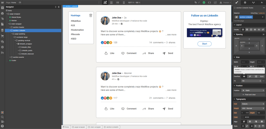
We have our section and grid with 3 columns. The goal is to make the elements in the first and last columns sticky.
Firstly, we're going to act on our main section. There is one major thing to look at in the style of this one. It is absolutely necessary that theoverflow of the section is visible (by default). Otherwise, when scrolling, your elements will not move an inch.
2. Alignment of the Webflow Grid elements
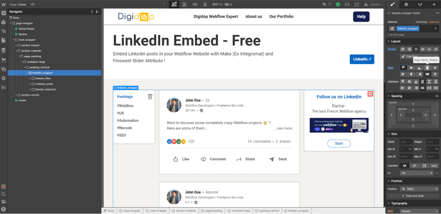
Now that we have done something about the section, we can look at the properties of your grid. Concerning the grid, there is also an important point to respect. In the "align" section, you should not choose the alignment: "Align item: Stretch". It is preferable to choose to align your elements at the beginning (start).
3. Set the sticky position to your elements
Once you have completed the above steps, all that remains is to put your sticky elements in. This step works exactly the same as if you were to put a sticky element in a display other than a grid.
3.1 Defining the position relative to your grid
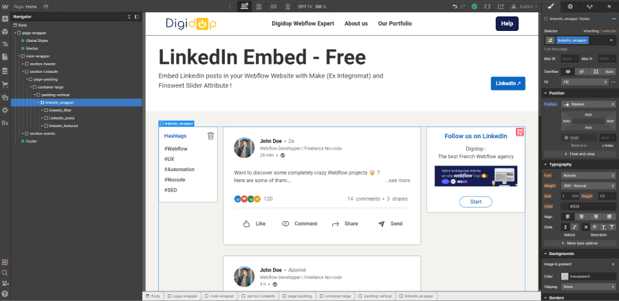
Before putting your sticky elements, the parent grid must be in relative position.
3.2 Setting your sticky elements with a value
Now, using our example, we're going to select our element from the first column and put it in the sticky position. However, if we limit ourselves to this, to scrolling, nothing will happen. It is necessary to define a value from which the element will start to scroll. In our example, we choose a value of 2rem from the top. Find out why you should choose REMs over pixels.
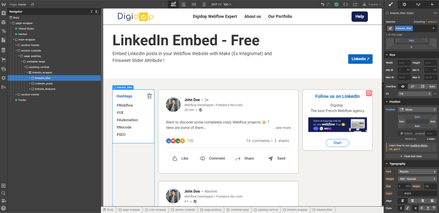
We perform exactly the same steps for our element in the last column.
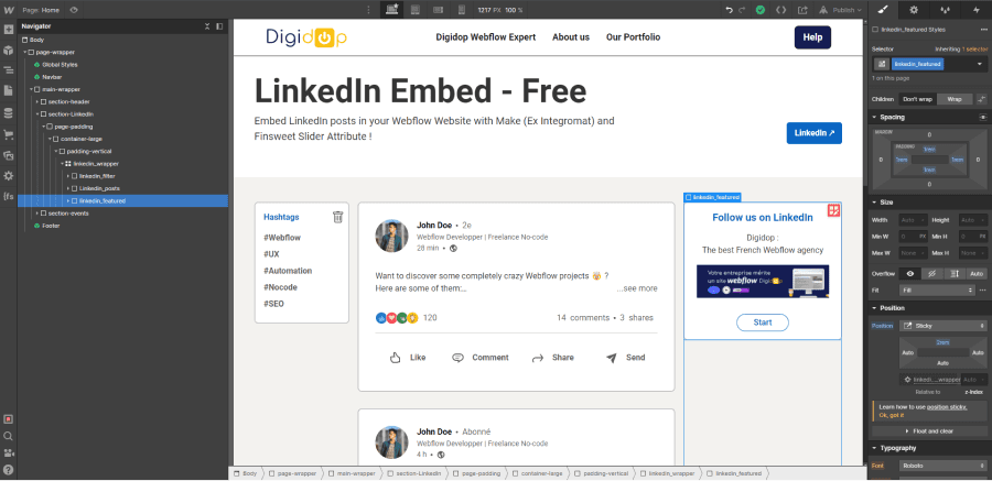
That's it! Your elements now scroll in your grid. To see the result live, you can check our free Webflow template: LinkedIn Embed Free.
That's it! You can now have fun and position your sticky elements in your grids on Webflow. To customize your projects even more, don't hesitate to read our article about positions in Webflow. You can also use our no-code agency for your website creation projects.


.jpg)


