In this article, we propose you to discover the different positions you can use for your elements when creating your Webflow website! Our guide to allow you to position your different blocks to the nearest pixel.
When creating a website, you probably want to have full control over the design of your pages. Fortunately, this is possible thanks to Webflow. Webflow is a tool thought and designed for webdesign (but not only 😉 ). When you create a Webflow project and develop your website, you can control everything. This allows you to have as only barrier your imagination.
Today we see once again the enormous design possibilities of Webflow when talking about positions. Positioning elements freely allows you to create modern and personalized websites. In this article, we will focus on the 6 types of positions that can be assigned to elements in Webflow.
PS: You can change the position type of an element in the specific tab of the Style Manager of the Designer.
1. The Static position
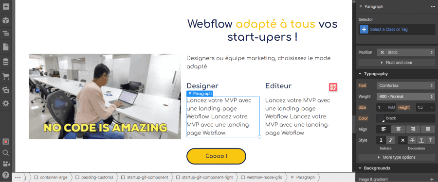
The static position is the default position in Webflow. This type of position allows the elements to be displayed in the precise order in which they have been placed. Depending on the defined layout, they will be displayed one below the other, side by side, in a grid, etc.
Thus, in a static position the elements have a well-defined place and will not encroach on other elements.
2. The Relative position
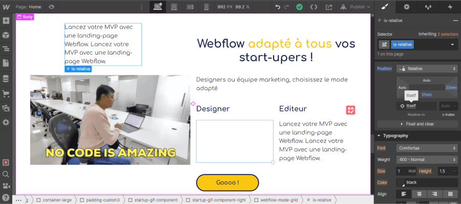
The relative position in Webflow is quite similar to the static position. The advantage over the static position is that the relative position can be moved in different directions (up, down, left, right) according to its base position without affecting the positioning of other elements.
In this particular context, we can say that the element is relative to itself. It is relative to its default (static) position. This can be seen in the small box "relative to": "itself".
You can position your element using the position editor. Simply give values to the different directions. The values can be given in pixel, percentage, em, rem, vh, vw or remain as auto.
It is important to note now that for future positions, the relative position will be a kind of reference. To be clear, an element in relative position will frame descendant elements in absolute, fixed or sticky position. These descendant elements will be positioned according to the nearest relative parent.
In addition to the position editor and the "relative to" box, there is a box for setting the z-index.
What is the z-Index?
The z-Index represents the third dimension in web development. We have seen that we can move the position of an element vertically (up and down) and horizontally (right and left). With the z-Index, we introduce a new axis to move the element in front or behind (on a 3d plane).
To be more precise, the z-index controls the stacking (front or back) of what we see behind our screen. Thus, it is possible to define which element should be in front or behind another if they overlap.
Note that unless a z-index is negative, your elements will always appear before static elements.
3. The Absolute position
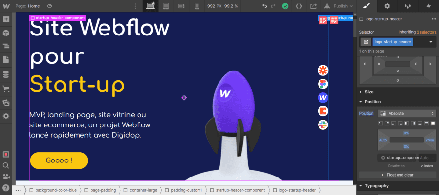
The absolute position gives us even more flexibility and possibility to position our Webflow elements. Just like the relative position, the absolute position offers the possibility to move the element freely on your page. In this case, the position of your element does not affect the position of the other elements and your element is not affected by the other elements (in terms of position). It is as if your element is outside your page.
By default, when you choose this type of position, your element is positionable in relation to your entire page (body). It is said to be relative to the body element.
However, you can position your absolute element relative to another element (within it). To do this, you must define the position relative to the ancestor whose position you want to frame your absolute element. Be careful, if two ancestors have a relative position, the absolute element will be relative to the closest parent in the hierarchy(Understand the element hierarchy in Webflow).
Webflow Tips: You can easily find out which element your absolute element is relative to with the "relative to" box.
The location is defined using the position editor (top, bottom, left, right) and the z-index defines which element takes precedence. There are also predefined layouts.
4. The Fixed position
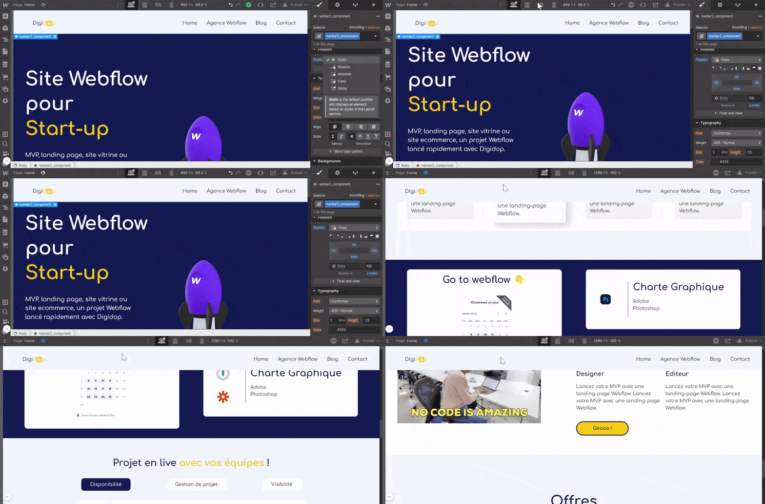
Webflow's fixed position once again pushes the limits of previous positions. First of all, it should be noted that the elements whose position is fixed are positioned with respect to the browser's viewport. The viewport is the part of the browser that contains everything that is visible on the screen at a time "t".
An element in a fixed position respects 2 rules:
1. The element is no longer part of the page flow (like the absolute position)
2. The element remains in its position even when scrolling
A fixed element remains in its defined position regardless of the interaction. This is a position that can be interesting for navbars, for example.
You can of course define a custom position using the position editor or use the predefined layouts.
5. The Sticky position
Sticky position is another type of position in Webflow. In Webflow terms, a sticky element is "relative to the document flow until a scroll position is reached. Once reached, the element takes a fixed position in its parent element.".
To summarise, an element with a sticky position will have a position that scrolls as you scroll until you move to a next section.
In order for the sticky position to apply to your element, it is necessary to specify at least one position value (top, bottom, right, left). The position value defines the location from which your element will take a relative position.
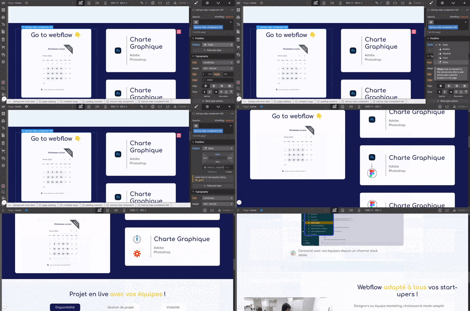
Useful tutorial 👉 Position a sticky element in a Webflow grid!
6. Float & Clear positions
If you want to show text (or another element) next to an image (or another element), you can use the float position.
There are 3 types of float positions:
1. Float None: No effect applies
2. Float Right: The element is positioned to the right of the parent element
3. Float Left: The element is positioned to the left of the parent element
The "clear" parameter allows you to delete this type of positioning. There are 4 types of "clear" parameters:
1. Clear None: No effect, the elements are arranged to the right, left or right and left of the parent elements
2. Clear Right: Prevents an element from being positioned to the right of parent elements
3. Clear Left: Prevents an element from being positioned to the left of parent elements
4. Clear Both: Prevents an element from being positioned to the right and left of parent elements

That's it! You can now place your elements wherever you want in your Webflow site.
If you want to learn more about Webflow's web design features, here is an article about the Style Manager. You can also contact our Webflow agency for your custom project.


.jpg)


